The Lost Library

A little about this project...
This project marked my first experience working with media queries and exploring responsive design. With no specific design requirements, I leaned into a theme that reflects my own interests: the joy of reading, especially fantasy. I blended that passion with a dark academia aesthetic to create a site that feels like a cozy corner for elves, fairies, or anyone searching for their next favorite fantasy book.
Technically, this was my first dive into responsive design, and I approached it from an unusual angle — adapting desktop-first code rather than starting mobile-first. While most modern workflows emphasize mobile-first design, this challenge gave me valuable insight into how responsiveness can be layered onto existing structures. It was both a creative experiment and a practical lesson in adapting code for different devices.
A Full Look
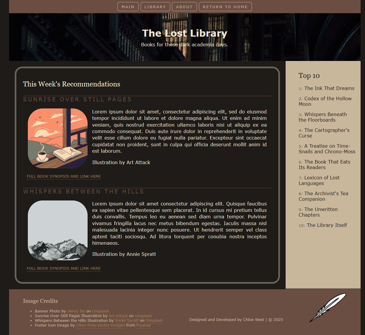
Project Highlights
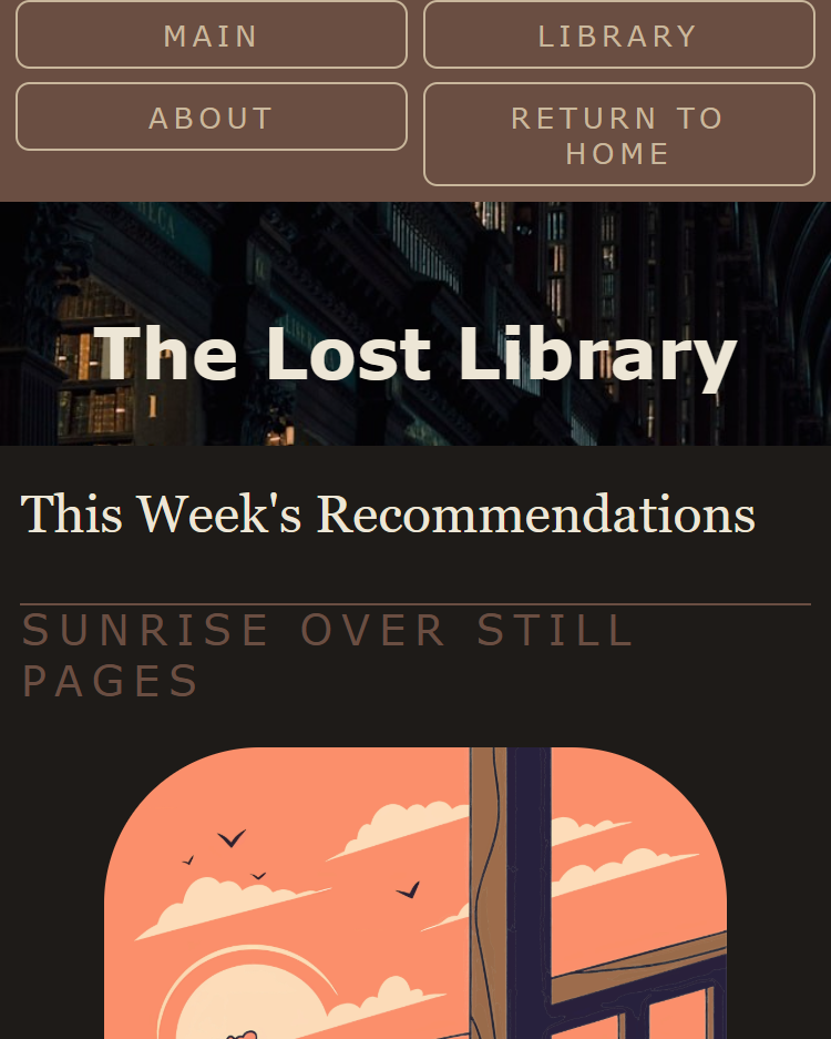
It's responsive
(Click the image below to see more)